Case Studies
The case studies in this portfolio are grounded in real-world problems I encountered as a nurse educator. Each one demonstrates my approach to human-centered design: the first enhances an existing digital experience, while the second introduces a new application crafted to address a recurring patient challenge.
Overview
- This project seeks to eliminate a pain point in an application for patients prescribed a specialty drug product. and create a new workflow which will facilitate patient access to the manufacturer co-pay savings card information, so that patients can access their medication quicker and continue engaging with the app to promote adherence and positive outcomes.
- Through patient interviews, I identified the pain point prohibiting access to medication, cross-collaborated with internal stakeholders to drive alignment on a user-centered solution, and generated prototypes for iterative review.
- Pain point elimination recommendation is in process with implementation slated for the next upgrade.
Background
- Acquisition of specialty drugs can be challenging to navigate for patients and healthcare provider (HCP) offices. Typically, insurance companies require a prior authorization and mandate which specialty pharmacy fills the medication. Specialty pharmacies use an overnight carrier and ship the medication to the patient or healthcare provider. Many patients are unfamiliar with this process and may not receive education on the process during their appointment.
- The HCP/ prescriber will enroll the patient in a patient support program with the drug manufacturer who strives to facilitate timely access to the medication, and educate on timely and affordable acquisition of the specialty drug. The drug manufacturer developed this app as a method of supporting patients prescribed their specialty products.
Pain Points
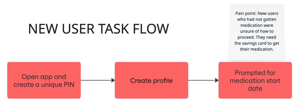
- New patients download the app to access savings card information to pay for their first fill of the medication. However, the app prompts patients to input their date of medication administration prior to having their medication. Since new patients have not started the medication, they do not have a start date. Patient should not get out of the screen prompting for a start date. They were not sure if they could edit a date once they input one. In frustration, patients would close the app, not access the savings card, and thus not fill their prescribed medication, delaying access to medication. If the patient opted into the patient support program for a nurse to call them, the nurse would communicate a workaround to input a fake date that can later be edited. Patients did not independently arrive at this solution.
- Some patients who entered a placeholder date did not know to find the savings card in the resources tab.
User Research
During information interviews, I uncovered the pain point and subsequent disengagement from the app. The impacted personas include the early and late majorities who understand the benefits of a digital savings card, but lack the technological aptitude to bypass the pain point
- Some first-time users want to engage with the app, but the pain point prevented them from accessing their medication. They need an app flow that allows them to access their savings card without asking for dosing schedule details.
- Other patients may have a first dose received via sample and need access the digital savings card for the first specialty pharmacy fill
- Customers unable to affordably access medications get frustrated and may ask their HCPs for another prescription with less barriers to access.
Personas

Experienced Edwin
Experienced Edwin is a 45-year-old man who lives in Boulder, CO. He has a master’s degree in marketing and works in mar-tech. Ed is technically savvy and may not consistently use the app for his dosing schedule as he prefers his online calendar with work and family appointments. Through his employer, he has commercial insurance. He would prefer to access the savings card on the app, so he can store it in his mobile wallet easily. He had already met his insurance’s Out of Pocket (OOP) Maximum when he started the specialty product last year. At the start of the new year, when his deductible resets, he needs an intuitive way to access the savings card information without prompts related to his dosing schedule every time he logs in. We need to eliminate any friction between the dosing schedule and accessing the savings card.

Newbie Nicole
Newbie Nicole is a 35-year-old woman who works as a real estate agent in her hometown of Taos, NM. She has taken some college courses in real estate at the local community college but didn’t earn a degree. Although she uses technology at work and enjoys shopping online, she gets easily frustrated with new processes that lack clarity and with troubleshooting pain points. She is new to specialty products and receptive to the idea of an app for managing her plan of care. Nicole bought her insurance on the open market. She has a high co-insurance on her plan and is delighted for the manufacturer co-pay card given her fluctuating income. She needs an app that has a logical flow. Prompting to log a dose before she gets the savings card will cause her confusion, resulting in abandonment of the app. The app needs to create an intuitive location for savings card information regardless of dosing schedule, which is unknown to her until she gets a delivery date.
Objectives
User Needs
Creating a workflow that meets the needs of both first-time users and ongoing users will promote timely access to medication and continue app engagement. Decreasing the time for access to medication will improve patient outcomes
Business Goals
Providing a clear path to the savings card allows patients to fill their prescription sooner and thus creates revenue quicker. Continued app engagement promotes medication adherence, creating long-term customers, which maintains a revenue stream
Design challenge
Creating a user-centered digital platform from which patients can access the savings card with or without logging a dose while maintaining functionality for the users who track data related to administration and disease activity.
Ideation
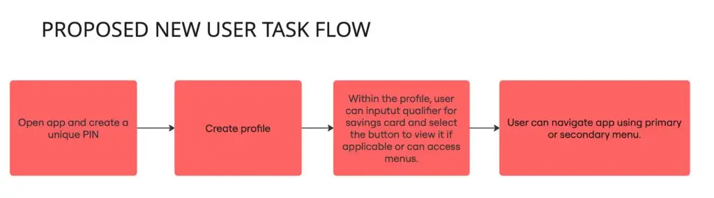
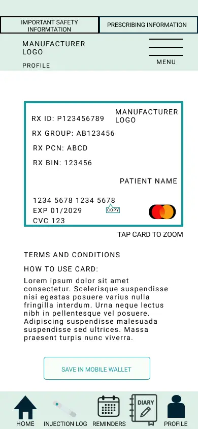
This project proposes the solution of relocating the savings card to the profile tab so that it can be accessed at any point in the patient journey.
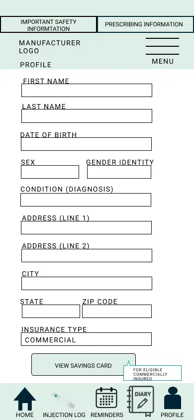
- Users with existing commercial insurance can simply navigate to the profile tab after logging in, while users with new commercial insurance can simply navigate to the profile tab after logging in.
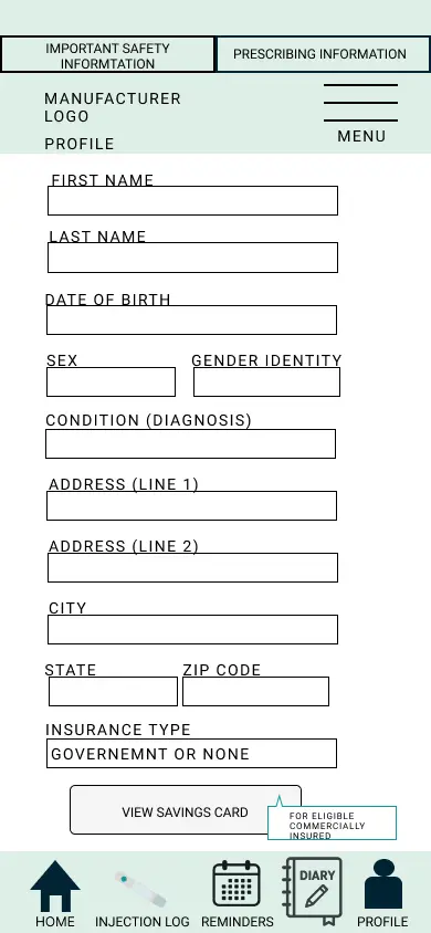
- Government and uninsured patients will have the same flow except the savings card button will be greyed out. When they hover over the button, the user will see a comment expalining that the savings card eligibility requires commercial coverage. Should they become commercially insured they can simply edit this in their profiles and access the savings card.
- Users who do access the savings card should have greater functionality with tap to zoom and copy features.
- Change the font color to increase readability and accessibility.
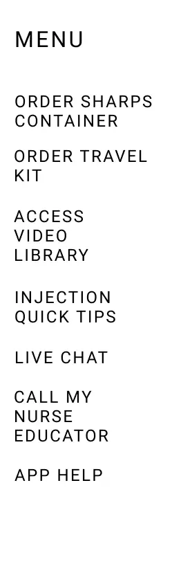
- The tabs are labeled in more patient-friendly language and represent more primary tasks while the hamburger menu houses more secondary tasks, allowing for a cleaner UI.
- Collaborate with developers to address loading speeds.
Video Walkthrough
Results
Elimination of the pain point of prompting to log a dose prior to accessing the savings card information is slated for implementation. My role was identifying the pain point through user interviews. The proposed solution is my ideation of a successful user flow. User testing has not been conducted on the proposal. This project highlighted the complexity of making a small modification to workflow.
Tools used: Figma | Figma Make | Miro
Overview
Title: Symptom Tracker for Pancreatic Enzyme Replacement Therapy
Role: UX Designer / Clinical Experience Strategist
Type: UX Design
High-Level Summary:
I ideated a digital patient support app to facilitate patients’ ease of tracking their symptoms, so that they can have more meaningful discussions with their healthcare providers (HCPs) and achieve better outcomes.
Background & Problem Space
Pancreatic Enzyme Replacement Therapies (PERTs) replace pancreatic enzymes in patients whose pancreases don’t produce the needed amounts of the enzymes used to break down food and absorb the nutrients. Food is composed of three macronutrients: carbohydrates, fats, and proteins. PERTs contain amylase to breakdown carbohydrates, lipase for fats, and protease for proteins. Patients who lack enough pancreatic enzymes to digest food will take PERTs with every meal and snack, so they can mitigate the symptoms of malabsorption. The amount of replacement enzyme needed may vary and require dose adjustments to achieve a therapeutic response. Patients can provide their physicians with real-time data of their symptoms to achieve symptom management, but they lacked a framework to collect this data easily.
Goals & Success Metrics
- Increased drug compliance and adherence
- Content that meets health literacy needs
- Provide visibility to nurse educator support
Research & Discovery
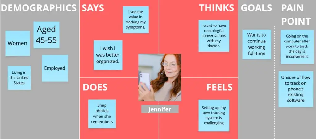
The current systems in place for patients to track their symptoms were not well utilized. One drug manufacturer provides a template that can be printed, but patients are not keen on carrying around paper trackers. Many patients don’t create their own digital trackers. Tracking on a home computer doesn’t work well as people may only have a mobile phone for online access and patients are less likely to log symptoms when it requires sitting down to do a task. A mobile phone app would allow patients to track their symptoms in real-time or edit symptoms at their convenience.
Many patients have multiple points of contact, (e.g. prescriber, nurse educator, pharmacist), and they would like a way to have all of the contacts organized.
Design Opportunities
- Create a framework for users to track symptoms.
- Include options for point and click as well as free text of symptoms.
- Provide export to HCP feature.
- Show compliance data to promote adherence to plan of care.
- Include nurse educator contact information so that users have one app as central resource.
- Add pharmacy information as an additional feature to improve organization.
Ideation
Impact & Expected Outcomes
- Patients track more data, sharing more accurate information with their providers, and achieve a therapeutic response more expeditiously.
- Increased collaboration between patients and HCPs.
- Faster access to care.
Tool used: Figma Make | Miro